New Logo - Need Feedback
Posted: Thu Jan 21, 2016 2:46 pm
Well, the logo deign contest entry period is now over. Now I have to decide which design to select as the winner. I have trimmed the 46 entries down to my top 6, which are shown below.
Please look over these and let me know what you think. You can vote for your Top 3 designs in the poll above. Note, I can ask the designer to make changes to their design, so you can also recommend changes to any of these. I've added comments as to what I would like changed with each of these.
Entry 11 - NayeemDesign
+ The site name needs to be more prominent.
+ The car needs to look more like a race car.
+ Tweak the color scheme a bit.
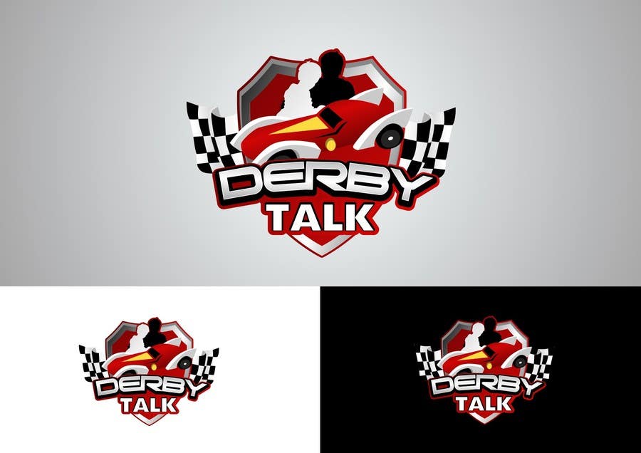
Entry 13 - Attebasile
+ Make the silhouettes a bit more obvious that it is a child and an adult.
+ Shield background needs to contrast with the car color.
+ Remove red outlining of the forum name.
+ Maybe change the car design.
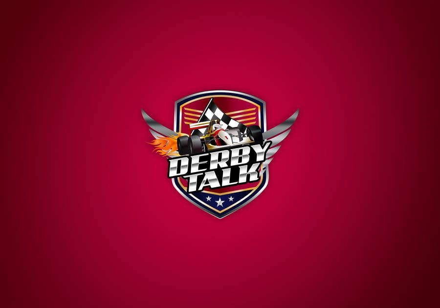
Entry 21 - kamikira
+ Get rid of the flames.
+ Remove the checkered flag.
+ Change bottom section of shield to be black and white checkered.
+ Move wings behind shield and give a 3D look.
+ Maybe change the wings to be exhaust pipes.
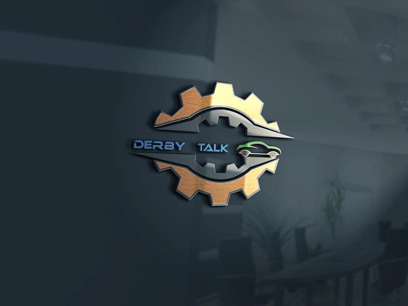
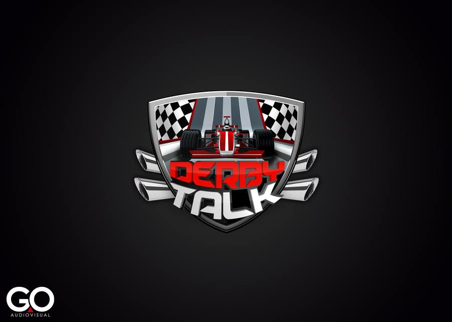
Entry 37 - publismart
+ Change car design to something that looks more like a PWD car.
Entry 39 - publismart
+ Change gear to a racing wheel.
+ Apply 3D effect to forum name.
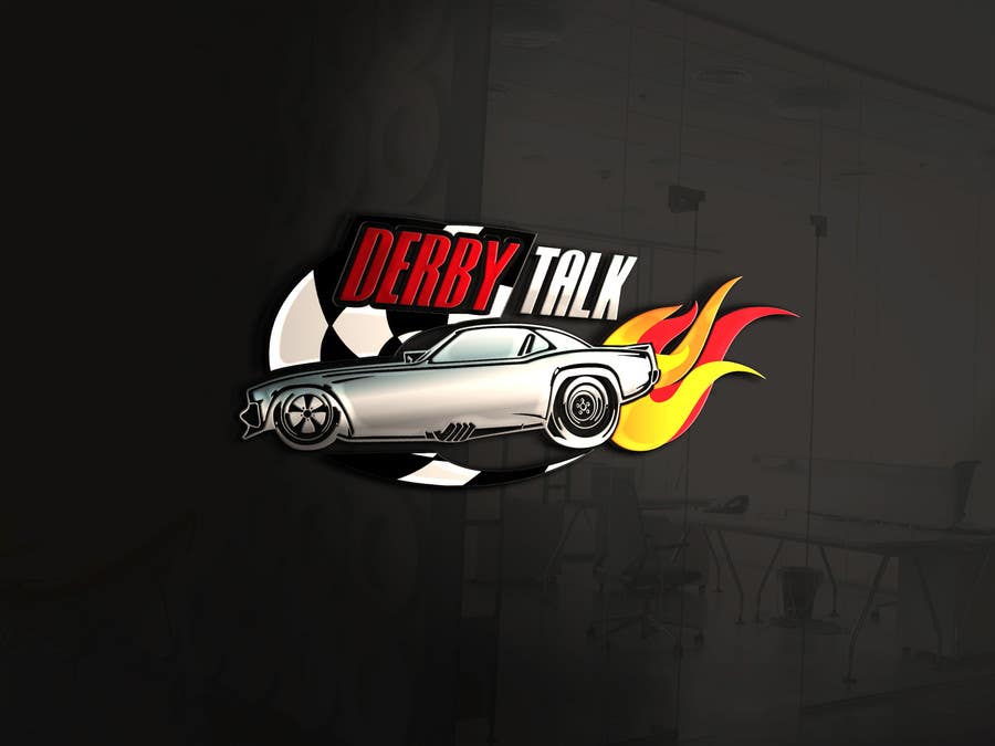
Entry 46 - THEGEOL
+ I like the PWD track look.
+ Remove grey outline from forum name.
+ Maybe inset forum name into the bottom section of the shield, instead of laid on top.
+ Maybe put forum name under the shield and use the bottom section of the shield for something else (but what?), or move the flag to the bottom section and use the corners for something else (but what?).
Post any comments/recommendations below.
Please look over these and let me know what you think. You can vote for your Top 3 designs in the poll above. Note, I can ask the designer to make changes to their design, so you can also recommend changes to any of these. I've added comments as to what I would like changed with each of these.
Entry 11 - NayeemDesign
+ The site name needs to be more prominent.
+ The car needs to look more like a race car.
+ Tweak the color scheme a bit.
Entry 13 - Attebasile
+ Make the silhouettes a bit more obvious that it is a child and an adult.
+ Shield background needs to contrast with the car color.
+ Remove red outlining of the forum name.
+ Maybe change the car design.
Entry 21 - kamikira
+ Get rid of the flames.
+ Remove the checkered flag.
+ Change bottom section of shield to be black and white checkered.
+ Move wings behind shield and give a 3D look.
+ Maybe change the wings to be exhaust pipes.
Entry 37 - publismart
+ Change car design to something that looks more like a PWD car.
Entry 39 - publismart
+ Change gear to a racing wheel.
+ Apply 3D effect to forum name.
Entry 46 - THEGEOL
+ I like the PWD track look.
+ Remove grey outline from forum name.
+ Maybe inset forum name into the bottom section of the shield, instead of laid on top.
+ Maybe put forum name under the shield and use the bottom section of the shield for something else (but what?), or move the flag to the bottom section and use the corners for something else (but what?).
Post any comments/recommendations below.